Tag Archives: Corvallis artists

Christmas Bride

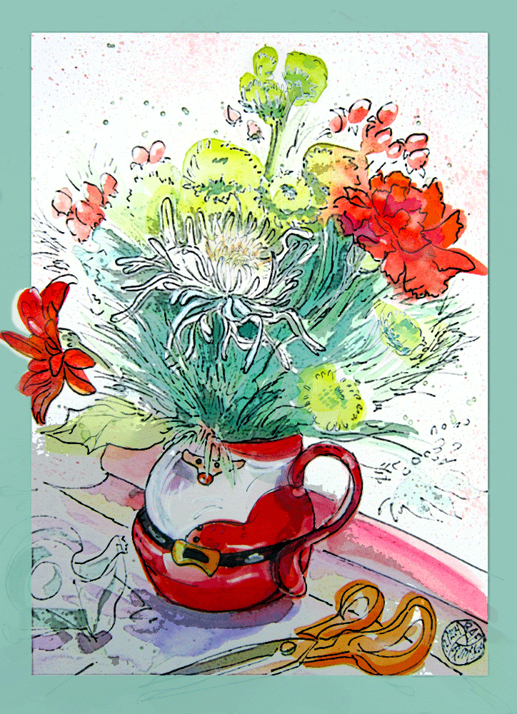
Santa mug flower arrangement

“Gift for the Giver”, based on a Random Acts of Flowers arrangement, mixed media by Kerry McFall

I lit a cinnamon-roll scented candle and put a CD into the player the other day as I was about to start this painting, and was transported back to 1964.  At the first “DooWaaaaah” from the Ray Conniff Singers (yes, DooWaa’s are a major feature of their version of “White Christmas”), I was surrounded by a sea of Harvest Gold shag carpet, and I could feel the pressure of knowing that I should be doing my homework or folding the laundry instead of daydreaming about Christmas weddings.

Our stereo was a huge colonial-style maple edifice that occupied one entire end of the living room.  I cursed it every Saturday morning as I dusted the half acre lid, but when I opened it, I always felt like I was getting away with something slightly naughty. You had to be about 14 years old before you were allowed to actually play a 33 rpm record (play a record – doesn’t that sound archaic?), so it was kind of a Big Deal.

Sliding the Christmas with Conniff record out of the well worn jacket took coordination and hands big enough to span from the center label to the outer edge.  Heaven help you if you actually touched the grooves, and trust me, such things did not go unnoticed.  There was a special velvety brush and a tiny bottle of liquid for removing fingerprints and dust, always applied by my father with a stern lecture to the offender.  About the only thing worse you could do was to not put a screwdriver back in the proper hanger on his workbench…

I don’t know much about music, my own musical education consisting of about 4 piano lessons at age 8 from Mr. Fox, an old man with a huge nose that he actually powdered.  But “Christmas with Conniff” was a beloved family Christmas tradition, and without intending to commit it to memory, I know every note, anticipate every cheesy call of “Hey, kids, wanna build a snowman?”  Only from Conniff have I ever heard calypso guitar, drum brushes, harp, tambourine, Irish tenor, and cowbell all in the same song: “Oh Come All Ye Faithful” never had so many minor falls and major lifts…

I remember listening over and over one year to the song about being a Christmas bride… “Santa, make me his bride for Christmas…” But that never happened, the jerk didn’t propose.  My little brothers put their allowances together that year and bought me a tiny diamond pendant necklace for Christmas.  Very uncharacteristic of boys who usually showed their affection for me by feeding my date’s hat to Heather the Disappearing Airedale.

My own kids have endured the album (…and the tape, and now the CD…and me singing along!) with relative good humor for their entire growing up years.  My daughter is about to become a bride for Christmas, and I’m lobbying hard for “Christmas Bride” to be on the wedding dance tape my son has promised to produce.  My grandson, who is considerably cuter than me, is lobbying just as hard for, “Who Let the Dogs Out”, so we’ll see how much clout me and Mr. Conniff can still wield!
Arranging Flowers: Not-So-Random Acts of Volunteers

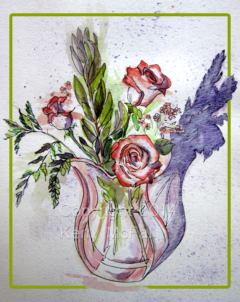
sketch of coral roses

“RAF Coral Roses”, mixed media by Kerry McFall

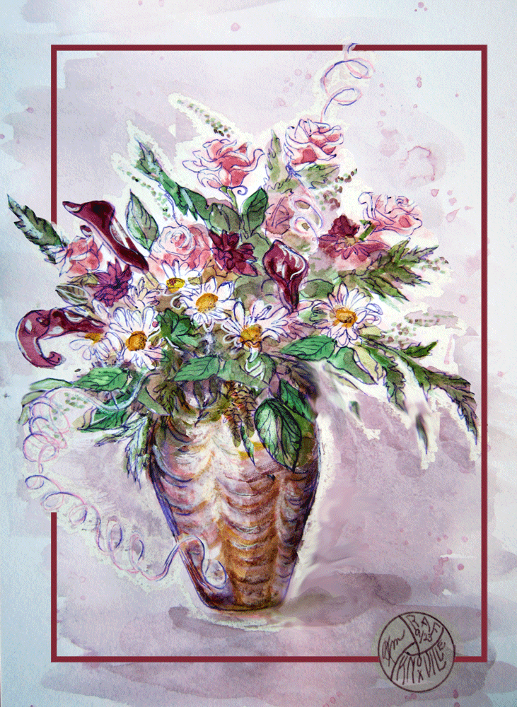
Tuesday morning the Random Acts of Flowers office was a sea of roses and leafy branches, bordered by dozens of vases and rolls of ribbons – a flower lover’s Disneyland!  After my flower arranging class a couple of weeks ago, I had worked up the nerve to volunteer.  The other volunteers were cinching up aprons and diving in to the blooms as my new friend Lorraine showed me the ropes (and scissors, and wires, and even how to de-thorn roses using a little flexible plastic soap dish!)  Many of the volunteers were seasoned regulars, and by working with them, I learned all kinds of interesting tips and tricks.  The most important thing: shop the entire room, plus the cold room, plus the vase warehouse, because you just never know what treasures lurk beneath the tubs of blossoms.  Treasures like dried cattails, bunches of those little red or pink berry thingies,  a clear coral-colored lucite vase, probably vintage 50’s ( I managed to snag that one!)  Or three velvety deep burgundy callas, ever so gorgeous and elegant, plus a metallic 80’s-style vase which coordinated perfectly with them, which became the inspiration for this arrangement by another volunteer:

sketch of metallic vase and flowers

“RAF Gorgeous”, mixed media with digital manipulation by Kerry McFall

Time flew past as we all chatted and clipped and consulted.  I was in my “arting happy place,” that same place I find myself when I draw or paint: completely oblivious to anything but what is before my eyes and in my hands.  Noon already!  And I was thrilled to look up and now see wave after wave of carefully arranged flowers, each one unique to the arranger’s designs and whims, each one including a Random Acts of Flowers card with the name of a sponsor or donor.  The flowers had come from weddings, events, florists, families; some arrived in perfect conditions, others needed serious de-constructing and trimming and rehabilitation in a fresh water bath.  Another set of volunteers had accomplished all that earlier on Monday.  Still other sets of volunteers spent hours washing and counting vases (recycled or donated), cleaning up after everyone else, and finally delivering the arrangements, delivering the smiles.

It occurred to me only as I was too tired to really do anything about it, that I should photograph some of the arrangements and paint them.  Another volunteer was talking about making prints of photos or paintings and doing cards or a calendar, thus giving the arrangements an even fuller life.  Hmmm… great idea!   So as a possible proof of concept, here are two paintings, the first one based on my favorite arrangement that I put together, the second one based on one of the volunteers’ favorites that hadn’t already been put on the delivery van by the time this inspiration struck.

What could be better inspiration?  All the flowers and arrangements and creative arrangers that I could possibly imagine, a fun group of volunteers to work with, and smiles all around.  I’m liking Knoxville!

Technique Notes:  I photographed the arrangements in the workshop – not the best lighting, but a good tool for remembering details.

Back in my “studio” (aka the dining room table,) the first painting was lightly outlined with transparent watercolor, spattered with a toothbrush all over, then lines were drawn with ink.  Several more layers were then painted using both opaque and transparent watercolor, and highlights were emphasized with wax pencil and white Sharpie marker.

The second painting was done using the same sequence, only more wax pencil to make the batik-type white edges.  BUT after all that fuss and bother, it wasn’t as colorful as the original, and I didn’t like the proportions – wonky vase, flowers not big enough, etc….  So I fired up my Photoshop and messed around until I had it closer to what I originally intended – ain’t technology grand?

sketch of saloon building

Knoxville’s Old City

This building is about a two block walk from our apartment under the bridge on Jackson Ave, in what is now known as the Old City.  It was built in the railroad district, an Irish neighborhood.  Diagonally across the street, is a Scottish pub featuring “Tatties and Neeps”, whatever that is… I think I’ll be having that for lunch at some point soon!

The posters in the window say it is available, but I’ve heard that it’s being remodeled.  I hope they hurry so we get a chance to enjoy it!  This was drawn from the patio of the restaurant across the street, shaded by dogwood trees – a great site for plein air.


Community Poetry Birdhouse – If Wishes Were Fishes

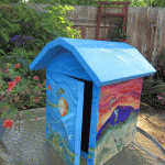
Linn Benton Community College sponsored a call for artist’s this spring asking for artist proposals to decorate “birdhouses” that will be mounted in their Albany campus parking lot.  But there’s a catch – they aren’t for birds!  They’re for interactive poetry… watch for more information from LBCC about how that will work, but in the meantime, here are some photos of my birdhouse, titled “If Wishes Were Fishes”.

When I heard the title for this project, words began to pop into my head: birdhouses > feathers > flight > community > a sense of place > icons >iconic fish > flying fish… and finally a snippet of a poem, “If wishes were fishes, then horses would ride.” I have never really understood that phrase, but I’ve always loved the mental images it inspires! So instead of birds being the focus, my sketches took shape as fish flew inand out of water waves and air waves, progressing through a day and a night in our part of the Willamette Valley, represented by Mary’s Peak and satellite imagery of the rivers.  My background as a fiber artist means that I just had to find a way to include some fabric, so the interior became a silky, glimmering stage to receive the poetry notebook.  A very fun project!

A Few Minutes’ Peace

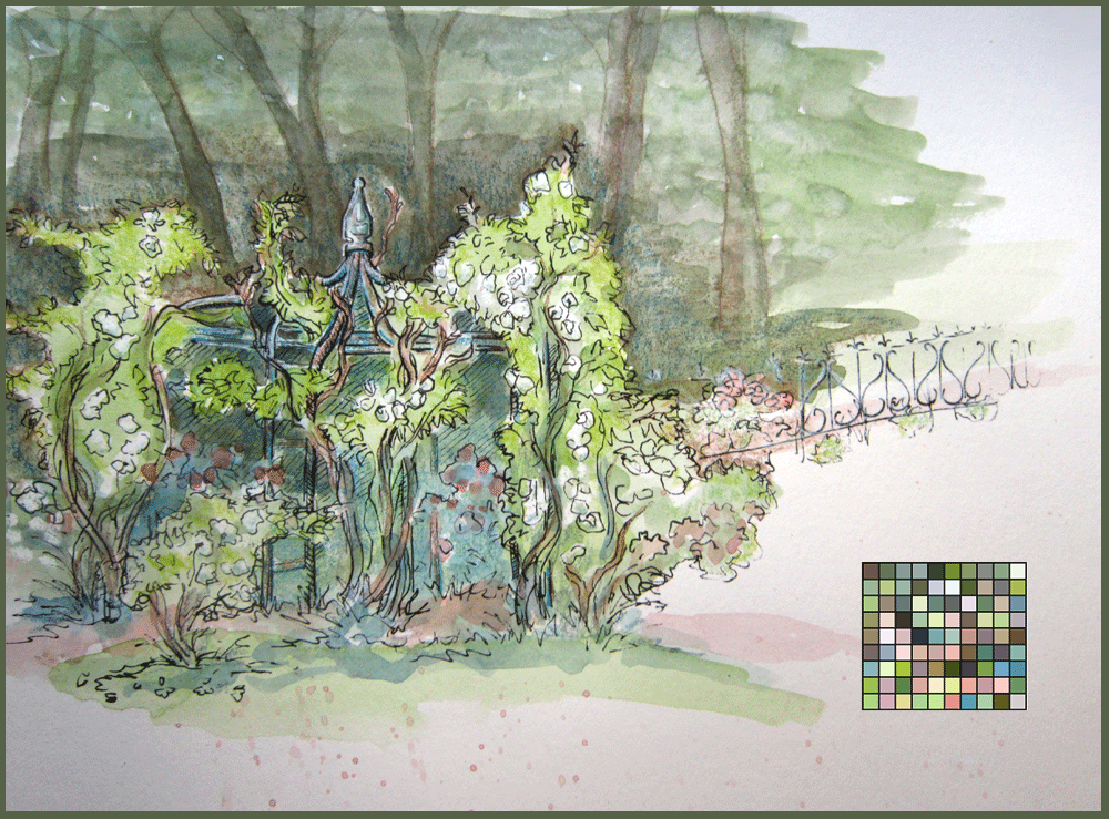
white roses on rose arbor

“A Few Minutes’ Peace”, mixed media by Kerry McFall

The world has been at “Sixes and Sevens” lately (I first heard that phrase years ago in the play THE SKIN OF OUR TEETH by Thornton Wilder, my one and so far only venture into acting.)  The total insanity of national and international news sometimes just washes over me and makes me feel … can I even describe it?  Middle-aged and cynical?  Sad and wrung out?  If you’re old enough to remember the 60’s and you’re not frustrated, you’re not paying attention.

This is when gardens and open spaces are critical – close to home and easy to get to.  Earlier this week I was able to spend a few quiet moments in the rose garden at Avery Park.  The sweet scent was soothing, and in spite of the park designers’ best efforts to install all benches facing tree trunks instead of roses, I found a shaded spot where I could see  to draw just this little snippet of the garden.

At first I was annoyed that pretty much all I could see were white roses.  My grandmother used to say that white flowers were pointless – if you can’t have color, why bother?

Drawing the curliques of the little run of Victorian fencing forced me to slow down mentally and concentrate: up, down, and around, over and over.  The breeze in the trees was reassuring.  As I began to paint, I decided I was glad of the white roses, they were not clamoring for attention, not insisting that I mix just the right shades to achieve their colors.  They were like cold clear water on a scorching day.  My intention was to finish by writing something profound in the bottom right corner, but my mind went to mush, so I used the space for a palette square “quilt” (which had a surprising lot of colors even with the white roses!).  And I felt so much better afterward: a final drawing to finish off this sketchbook, and a few minutes’ peace to carry with me into the fray.  Life’s Rich Pageant Marches On.


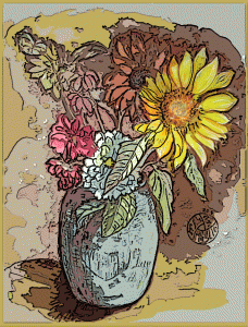
Sunflower Showstopper

"Showstopper", mixed media by Kerry McFall

“Showstopper”, mixed media by Kerry McFall

When you put a sunflower into a bouquet, all the other flowers just have to take a backseat.  The bright yellow outshines anything and everything, and this one appeared to be holding a leaf out to cover up its closest rival, a white dahlia.  Speaking from experience, if you’re not paying attention, sunflowers are so heavy that they’ll tip over the entire vase!

I was playing with Photoshop techniques after I photographed the painting, and I liked this one almost as much as the original:

"Showstopper 2", mixed media and digital techniques, by Kerry McFall

“Showstopper 2”, mixed media and digital techniques, by Kerry McFall

Drawing Stuff

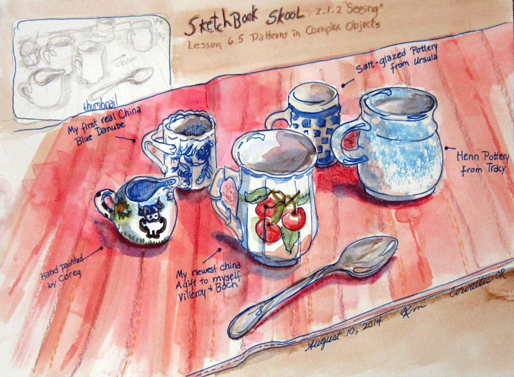
sketch of mugs and spoon

“Mugs” mixed media sketch by Kerry McFall

I’m almost finished with my Sketchbook Skool online course, “Seeing.”  It has been such fun, and I have learned a lot – and it has encouraged me to give myself permission to just draw stuff.  Drawing stuff, as opposed to creating a masterpiece for exhibition, is completely absorbing and relaxing.  Drawing stuff makes the world with all its insanity, both near and far, just fade into the background, like thin watercolor pigment drying on a hot summer day.

This assignment was to look at the patterns in objects (like teacups) and architecture, and to use a thumbnail to sort out the details in your head.  The instructor, Liz Steele, is Australian, and tea and teacups are two of her passions.  She understands a proper Devonshire tea much in the way that Americans do not.  Loved her attitude!

Unfortunately my teacups were victims of downsizing, and they are now packed carefully away in boxes in the garage (or is it the attic?), waiting for the next Christmas Tea.  But I do still have my favorite mugs handy, and drawing them was a trip down memory lane.  Each one evokes the face of a particular person or event at a time past, and the aroma of a cup of coffee, or the taste of tea with milk and sugar.  Sweet reminiscences.

A Question of Color


painting of bridge

“Golden Gate Bridge”,mixed media by Kerry McFall

As I stood beneath the bridge, I wondered why it looked so red.  It isn’t a bit golden!  So when I returned home and Google was at my fingertips, I typed, “Why is the Golden Gate Bridge red?”  Brilliant, incisive question.  As it turns out, not particularly original, since if popped up as an FAQ (Frequently Asked Question) on several entries.  Turns out it isn’t red either, it’s International Orange to be precise.  But I only had a red pen, so my color scheme can be chalked up to artistic license.

“Consulting Architect Irving Morrow selected the distinctive orange color because it blends well with the span’s natural setting as it is a warm color consistent with the warm colors of the land masses in the setting as distinct from the cool colors of the sky and sea. It also provides enhanced visibility for passing ships. If the U.S. Navy had its way, the Bridge might have been painted black and yellow stripes to assure even greater visibility for passing ships.”  Ooh, that would have been fun – then it could have been called the BumbleBee Bridge.

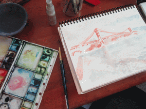
Here is a snapshot of the beginnings of the “fast/slow” process taught by Danny Gregory – a quick splash of color to get things going, then slowly add details as you really look closely at what you’re drawing.

watercolor beginning

“Golden Gate in Progress”, by Kerry McFall

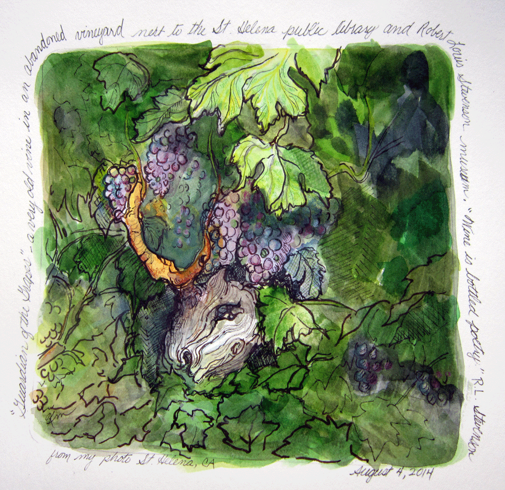
Guardian of the Grapes

gnarled grape vine

“Guardian of the Grapes,” mixed media by Kerry McFall

The best image from our California Wine Country tour was not in a vineyard, not in a tasting room, but in a vacant lot in St. Helena, beside the city library and the Robert Louis Stevenson museum.  I was sad to see the abandoned, gnarly old vines, looking more like tortured tree trunks or driftwood than anything I would recognize as a grape vine.  This one took the shape of a skull, maybe a horse’s skull, with what appeared to be an eye glaring up at me.  This year’s new growth sprouted from its forehead like horns, thick as my wrist.  The vines were heavy with grapes – blue, amethyst, amber, green – although some were raisins already, some mashed by unseen forces.  The message was clear:  try a grape at your own peril.  I fear for the future of whoever drives the backhoe that uproots this Guardian, this Demonic Troll… beware the uprooted ghost!

Wine Country 2014 – Mary’s Peak Doppleganger

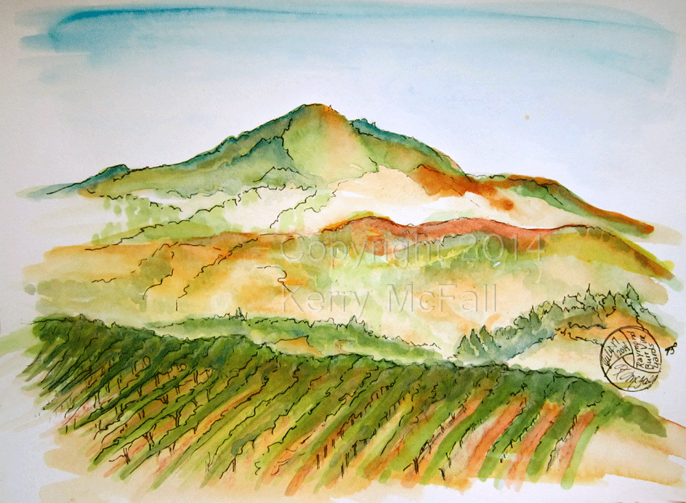
vineyard sketch

“PerryMasonVineyard”, mixed media by Kerry McFall

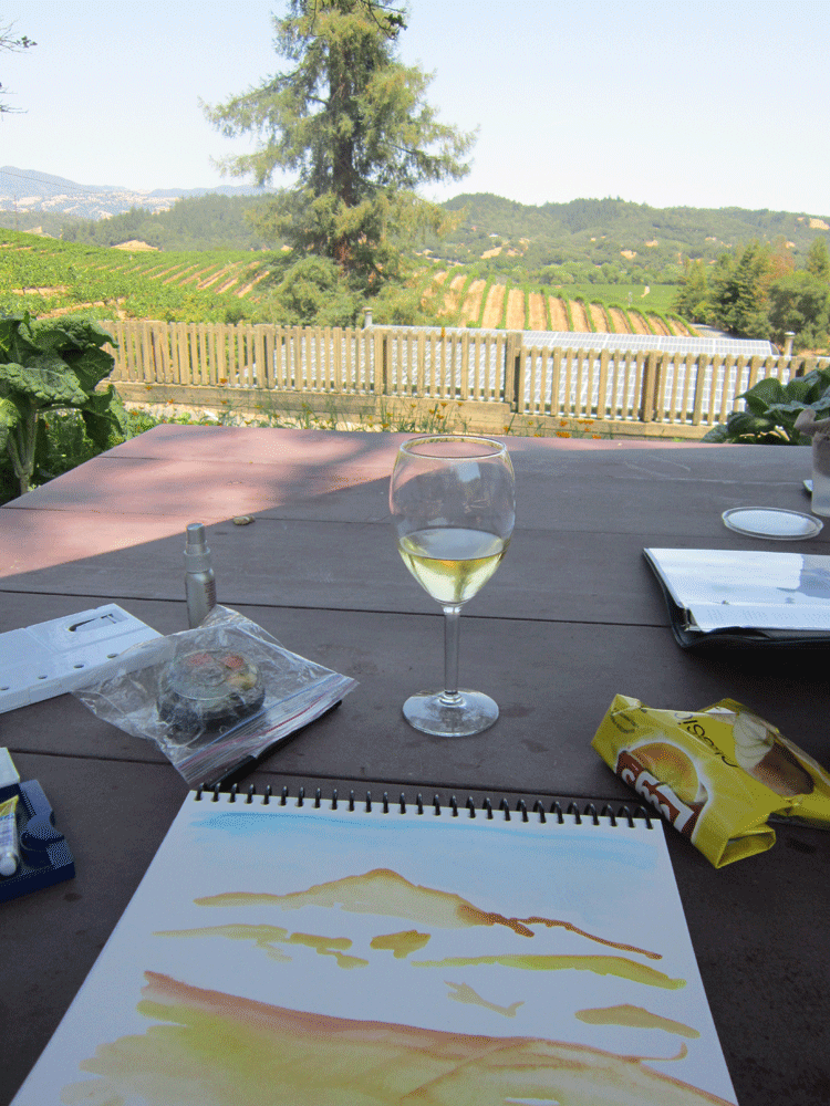
This small vineyard tasting room made us feel like we’d been invited to join Perry and Della for a glass of wine on their patio.  The tasting at the Raymond Burr winery is complimentary (kind of a rare thing as near as we can tell), and the gentleman who served us says that Della (Barbara Hale) still comes up for special occasions because “she’s family”.  We sat in the shade at one of the handful of picnic tables, me painting, Griff working, as we listened to an odd mix of hummingbird buzzes, roosters crowing, a mockingbird, and 1980’s pop music from inside the tasting room.

RaymondBurrPatio

We couldn’t have asked for a more perfect temperature (mid-70’s) or a more relaxing setting.  As you can see from the photo, I took the liberty of eliminating the big conifer and the brussels sprouts plants from my painting!   As I began to paint the big mountain (almost visible in the left of the photo, possibly Alexander Mountain but no one seemed really sure,) I gasped – the silhouette is almost identical to Mary’s Peak in Oregon!  A closer look revealed that the second hump is actually another mountain behind the first one.  Still, for a minute there I thought I had so imprinted that outline on my brain that I was no longer capable of doing an accurate mountain!

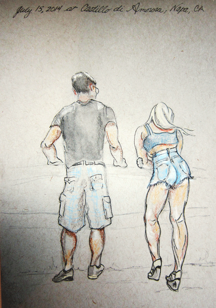
Lots more vine and vineyards paintings in the works, but here is a sketch of an unexpected view at the Castella di Amoroso vineyards in Calistoga:

"Unexpected Vista", mixed media by Kerry McFall

“Unexpected Vista”, mixed media by Kerry McFall