Tag Archives: watercolor painting

Let the Cherries Take You Away

Posted June 11, 2020 by Kerry McFall

Dark Cherries, mixed media by Kerry McFall

I recently saw a post (from Michelle Collier on Facebook’s Sketchbook Skool group) about “negative painting techniques”.  I was fascinated, so down the Google rabbit hole I dove, and began experimenting with what I have now come to think of as painting inside out.  It makes perfect sense currently, where everyone on the planet is at Sixes and Sevens (a British idiom for a state of total confusion).  We are re-thinking everything on every level: breathing, touching, going to work, cultural norms, racial stereotypes, rules of encounter, all of it.  We are re-learning lessons from the past, trying to understand how we got to this, hoping to re-build and build it better.  And yes, it is overwhelming.

So, be good to yourself every chance you get.  Case in point: I saw a big bag of fresh cherries at the Farmer’s Market down the street – it’s been re-worked for Pandemic Suitability, of course, but the cherries are still cherries, plump, colorful, enticing.  I ignored the sky high price, and bought the whole bag, knowing that although the cherries themselves would be gone very soon, I could paint them, and come winter I’ll be able to go back through the pages of my sketchbook and enjoy them over and over!

New (for me) Technique : Negative Painting

I usually start a painting with a sketch that roughs in all of the details, then I paint the focal points, and finish with the background.  Negative painting technique says ‘no’, do it inside out…  Start with the colors of what you want to paint, like cherries or leaves, just the colors, not the shapes, not the shadows.  Leave that pencil alone, pick up a big fat brush and get it juicy with color.  Slap it down, let it do its thing, trickle and run and meld.  Now go do the dishes (you know you need to anyway).

Work in Progress, Cherries Layer 1

(The small dark cherry up at the beginning of this post is what developed from the middle blob on the right side of this first layer.)  Once you’ve finished the dishes and your paint is now dry, maybe pour a glass of wine, and begin to pick out the edges of where your main shapes aren’t, aka ‘negative space’.  Go loosely, lightly, with a colored pencil maybe, drawing the shapes between the cherries or the leaves or whatever.  Soon the positive shapes come together from the outline of the negative shapes… then dip your brush in a darker color for the background, or dig out a big fat marker, or use the side of a colored pencil, and fill in that negative space.  Magic happens, and your cherries pop off the page!

Cherries Take Me Away, mixed media by Kerry McFall

This is when I struggle with knowing when to stop… I tend to overwork things, adding a shadow here and a highlight there, and fuss and bother about this and that, but it’s all part of the process, the process of learning, the art of relaxing and letting the cherries take you away from the 6’s and 7’s… Hmm, I just had a mental flash from an old Calgon bubblebath ad, “Calgon, take me away!”
 

Flatland Touristers (& Other Tennessee Road Hazards)

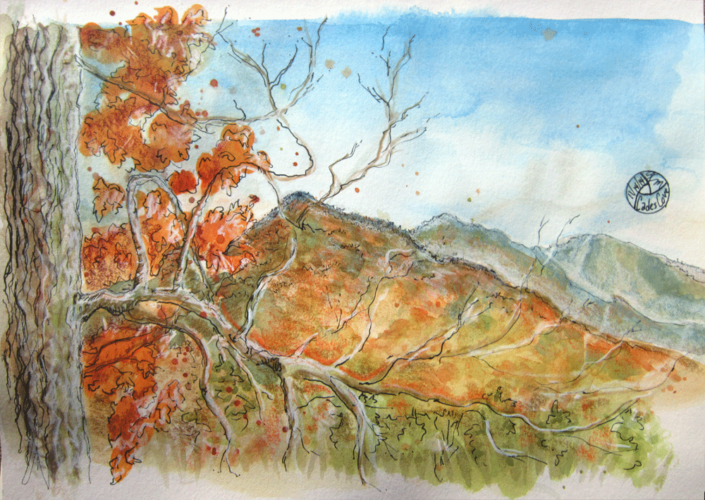
autumn colors in Cades Cove

“Unimproved Road”, mixed media by Kerry McFall

Ever heard the expression, “She looked like 10 miles of bad road”?  If there was ever any doubt in my mind about what that might look like, it was swept away last week when I looked at myself in the rear view mirror of our little Fiat.  Only it was 12 miles of bad road, to be exact.

If you go to Cade’s Cove, Tennessee, in the Smoky Mountains during the riot of autumnal glory known as “The Colors”, you will find a lovely valley, equipped with a one-way loop of perfectly good paved road, featuring fabulous landscapes and a few historic primitive buildings.  If you go with my husband, you will then find yourself taking the “Cherokee Graves Trail” shortcut, also known as Rich Mountain Road, out of the valley for the allegedly even-more-fabulous view from the top of the ridge. The entrance to the road is clearly marked with a sign reading “unimproved road“.  If you catch “The Colors” toward the end of autumn, the “road” itself will be all but invisible beneath a thick, lovely blanket of colorful leaves.

In Tennessee, apparently “unimproved road” is shorthand for a series of stone formations eroded into 12 miles of washboard switchbacks, pocked by deep pools of runoff, with steep dropoffs down one side and tangled tree trunks up the other.  Don’t even think of turning around, not even to save your marriage.   Until you hit the first rock formation at 30 mph, you might be convinced that it could at one time have been called a “road”.  However, it was clearly intended to be used as a footpath for bears and wild pigs.  The nickname about the graves begins to make sense about 6 miles in — we didn’t see any actual graves, but those guys were obviously murdered by their wives once they finally got to the top, because they still had to get the rest of the way down in the dark.

After this adventure, my husband is no longer allowed to call himself, “a Tennessee Boy” (or ‘Boah’ as the locals pronounce it).  For Christmas he will receive a custom-made T-shirt proclaiming him to be what his mother used to condemn, the dreaded and despised “Flatland Tourister”.

And in point of fact, gorgeous colors in the dark are simply… dark.


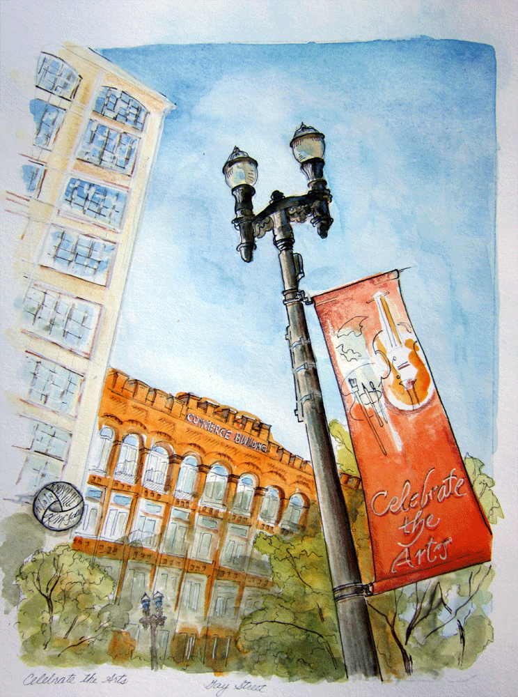
Celebrate the Arts!

painting of Old City Knoxville TN

“Celebrate the Arts!”, mixed media by Kerry McFall

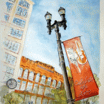
This is the third in my Old City Knoxville series.  Last week at sunset I was looking up at the Commerce Building on Gay Street, wishing that modern architects understood the appeal of arched windows, and loving the way brick ages.  I had hardly even noticed what the text on the banner said — I was thinking that between the brick and the banner I could get a very “University of Tennessee Orange” color scheme.  Serendipity – it was about celebrating art!

This series has become an adventure in painting with the color palettes of old brick.  I am becoming more and more enamored of the brick “pentimento,” those vintage painted signs that can still be seen on many buildings, advertising “shoes and rubbers” or “the best part of the meal”, some in layers over each other.  Here in the Old City, it’s like searching for ghosts from Knoxville’s Industrial past, peeking between old factories and new skyscrapers to find clues of who used to work and live here.

Knoxville local developers have made a good faith effort to revitalize the neighborhoods yet keep the architectural “old city” feel.  We have been staying here downtown now for going on three months, and loving that art is indeed celebrated, and so is fine dining, not to mention we can walk everywhere, or take a free trolley.  That being said, I can also see the unintended consequences: every time one of these grand old buildings gets renovated into condos or upscale retail or office space, another artist has to find a different and affordable studio or gallery space, because yeah, most artists can’t afford the upscaled rent.  That means moving ever further into the abandoned industrial (and sketchy, in the personal safety meaning of the term) areas, or out into the vast strip mall wastelands of Kingston Pike. Ouch.

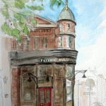
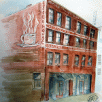
Here’s a glance at all three in the Old City series together – please remember that you can click Buy Now to get your own prints for just $18 each!